
San Francisco Museum of Modern Art
Brand & Identity System
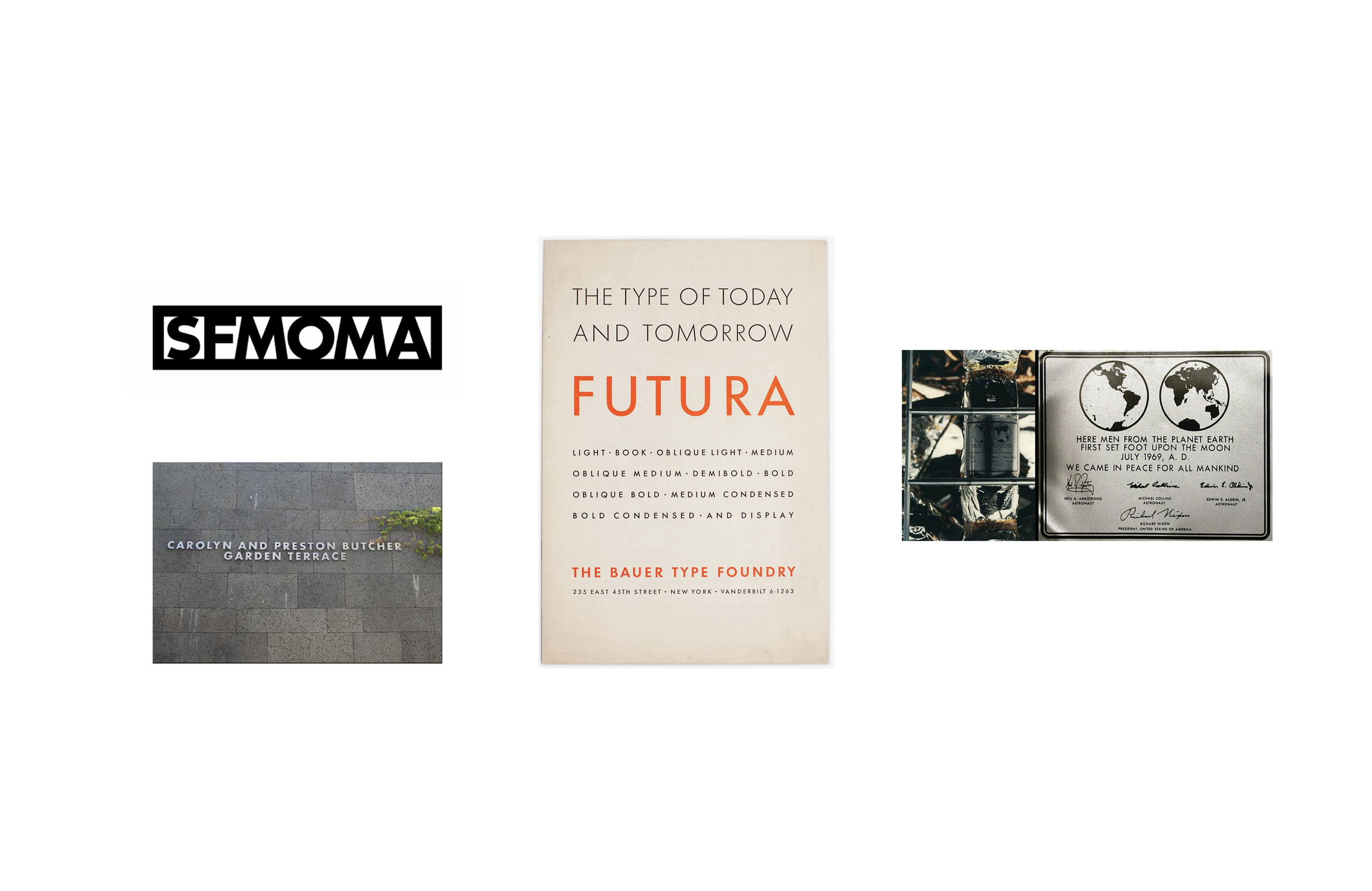
Framing the future of modern art
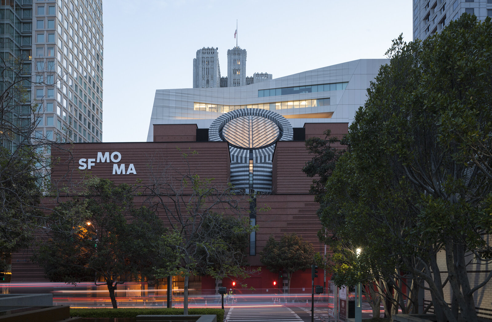
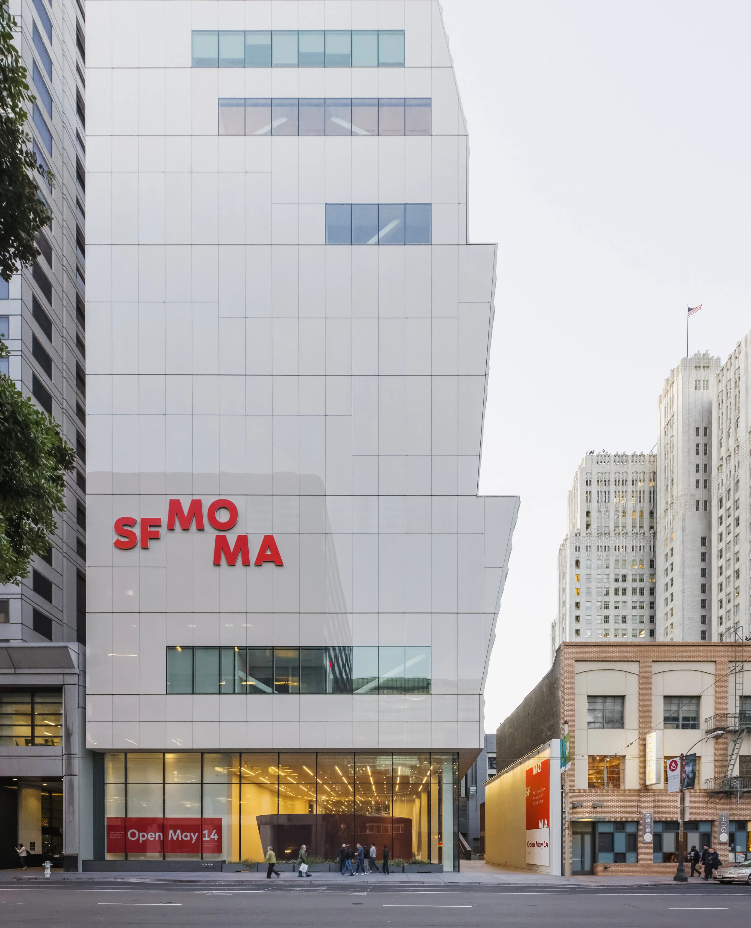
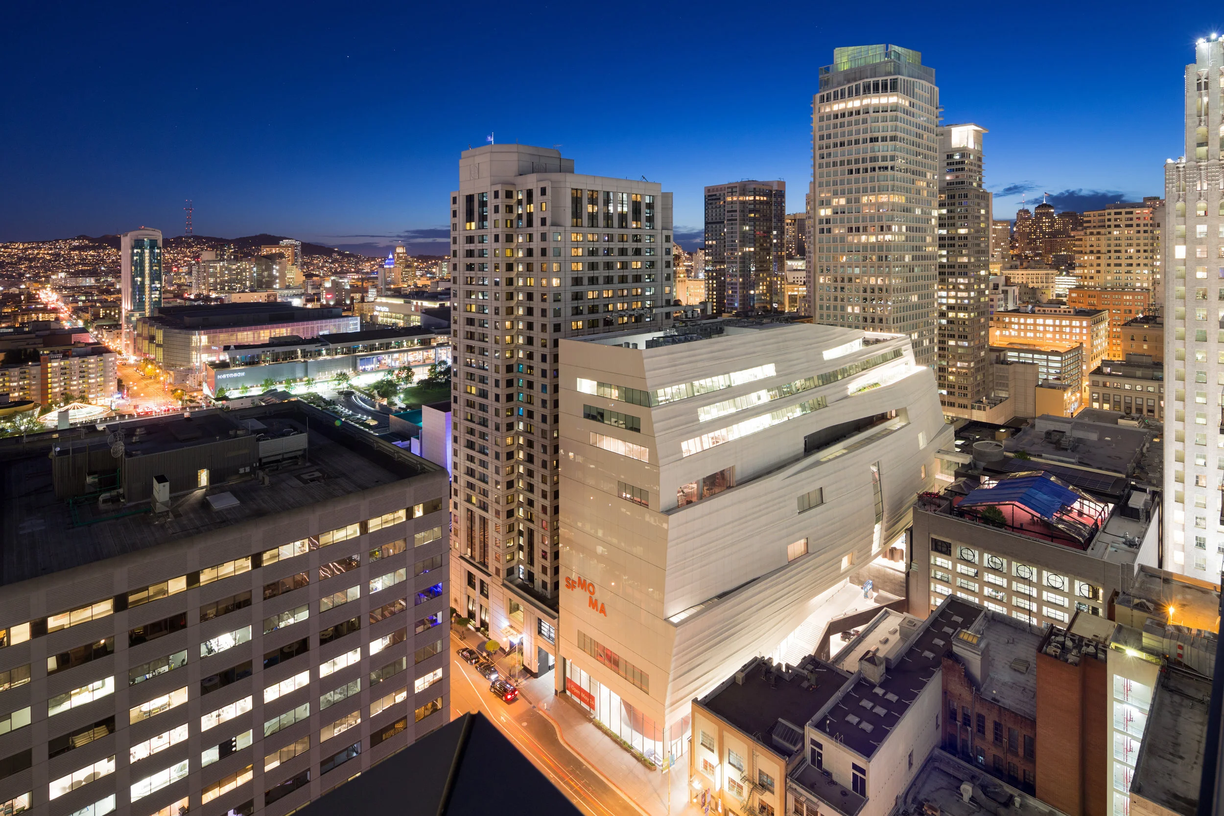
When the San Francisco Museum of Modern Art reopened as one of the largest modern and contemporary art museums in the U.S., the in-house studio undertook a ground-up rebrand to match its expanded scale and ambition.
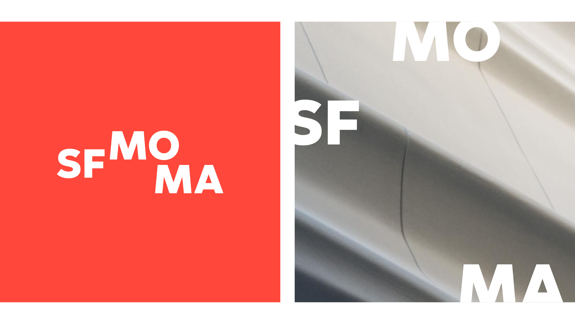
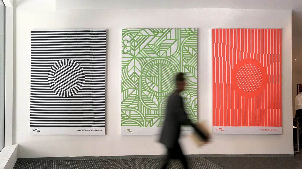
Inspired by the building’s architecture, the identity is deliberately porous—flexible and inviting, shifting across formats, exhibitions, and digital platforms. More than a logo, it functions as a conceptual lens, framing the museum’s program and reinforcing SFMOMA as a dynamic, living institution.
Project scope:
Branding & Visual identity
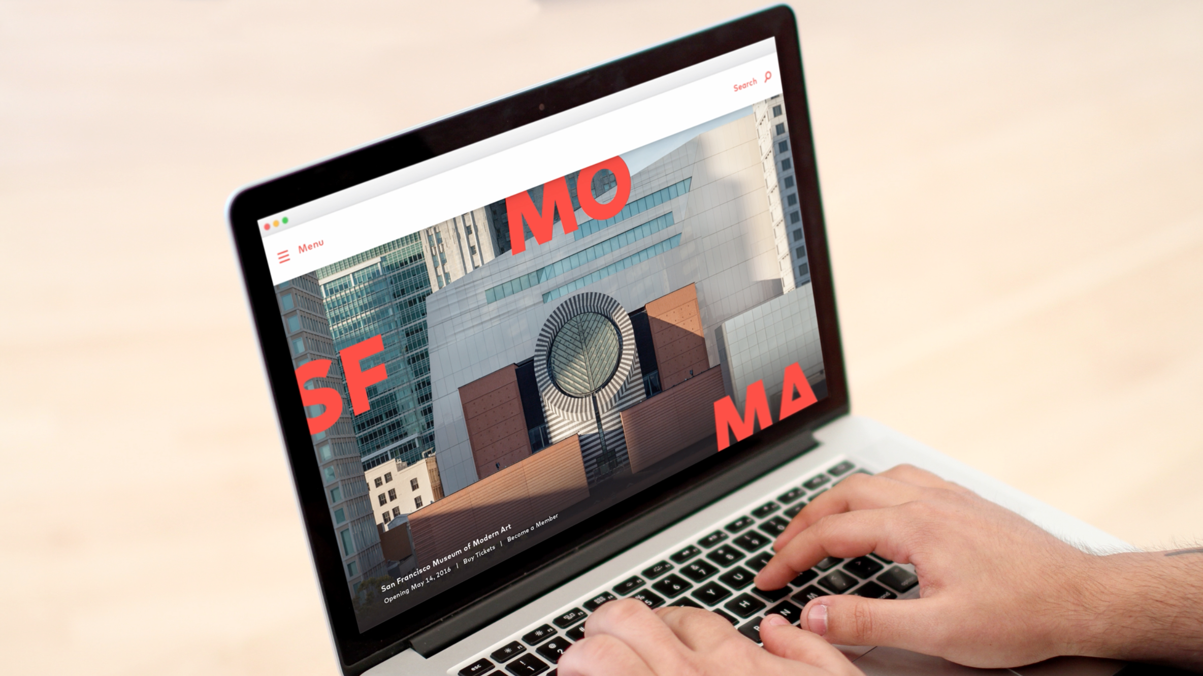
Website redesign
Custom typography
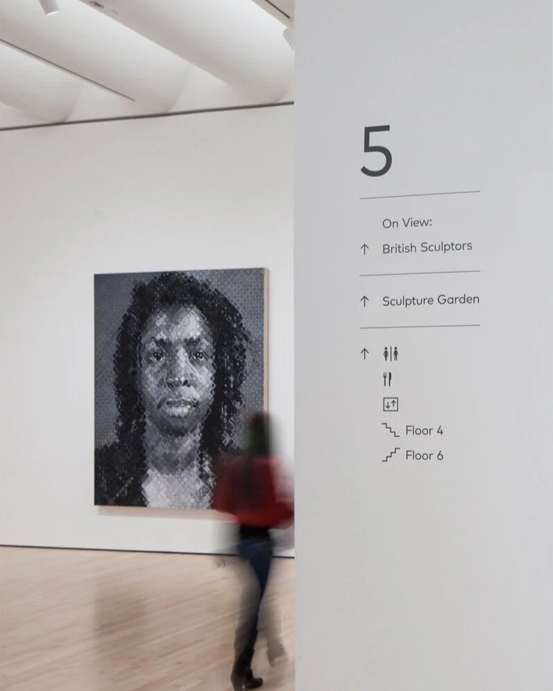
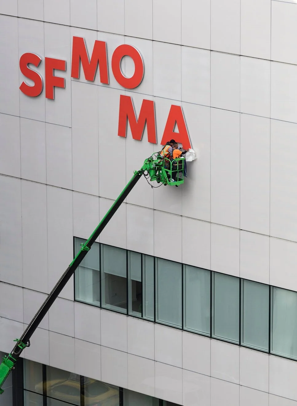
Architectural signage
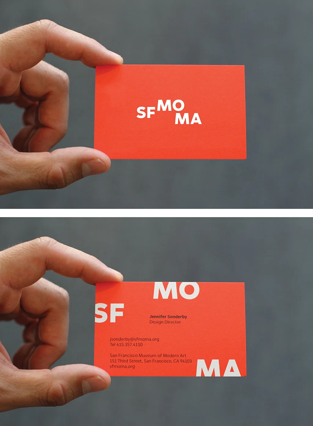
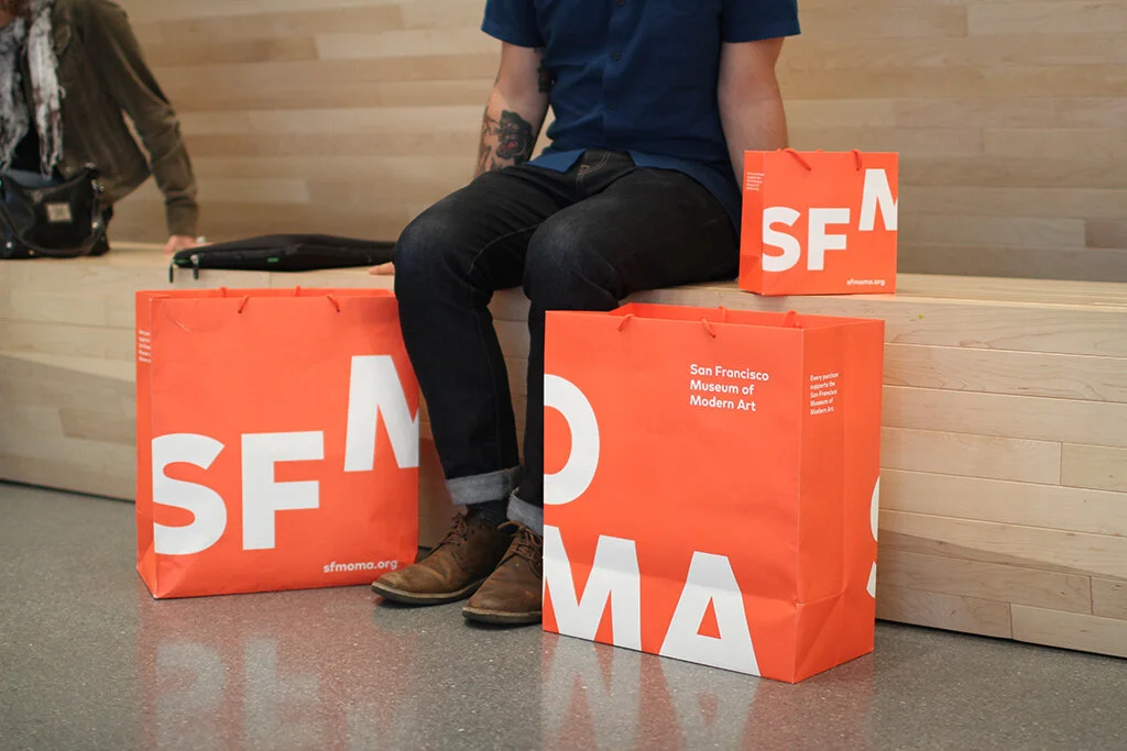
Print & retail collateral
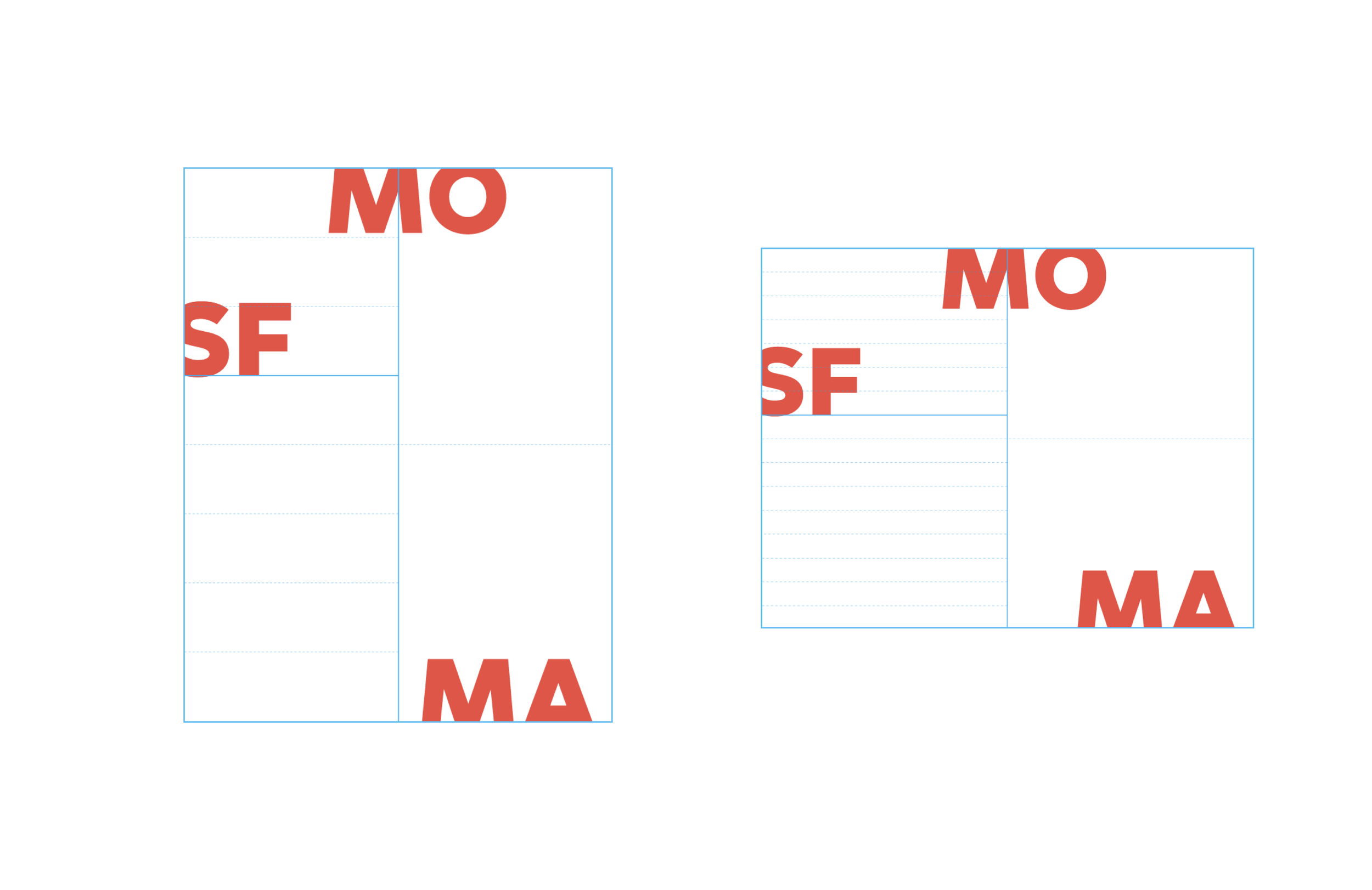
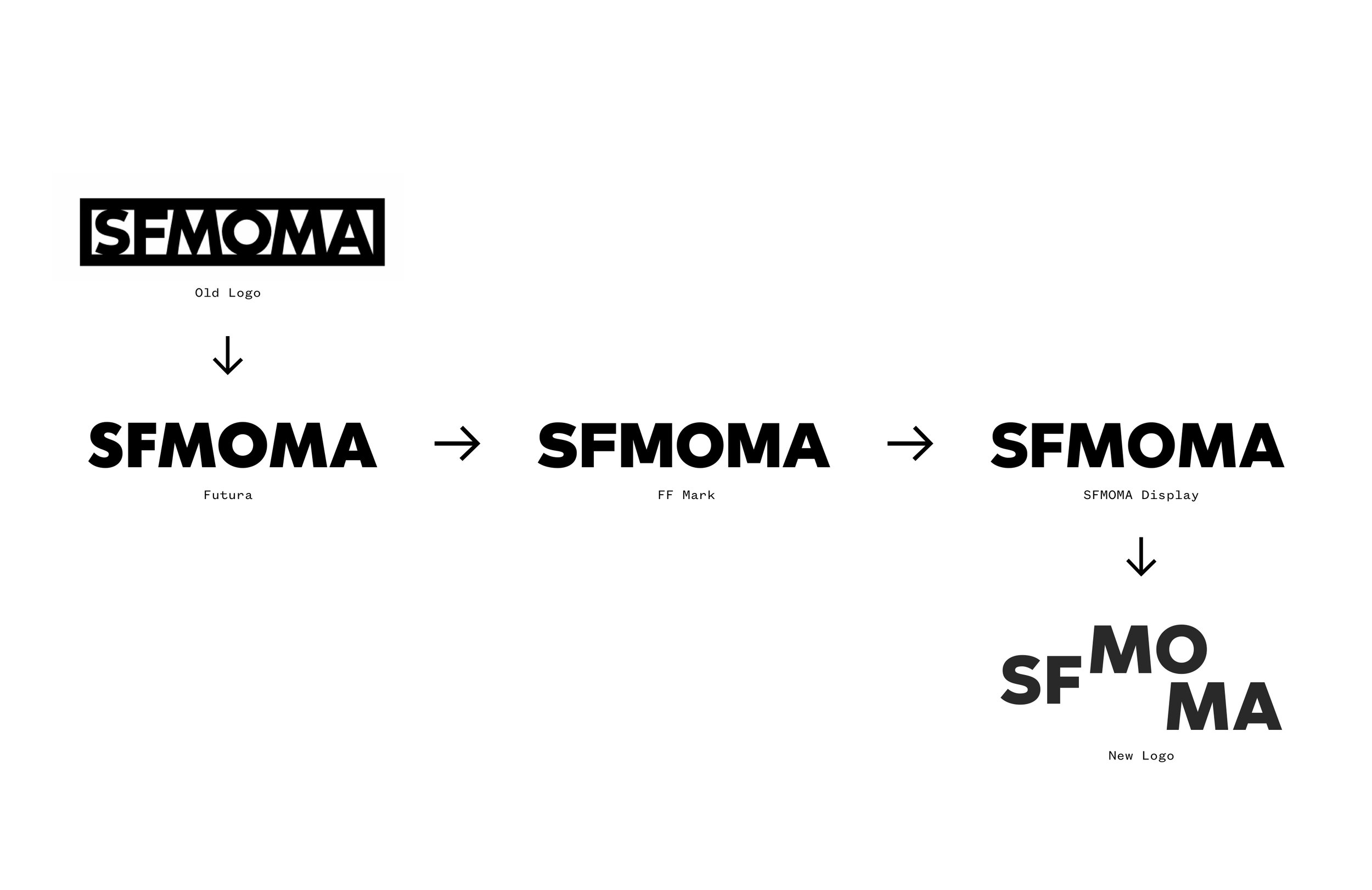
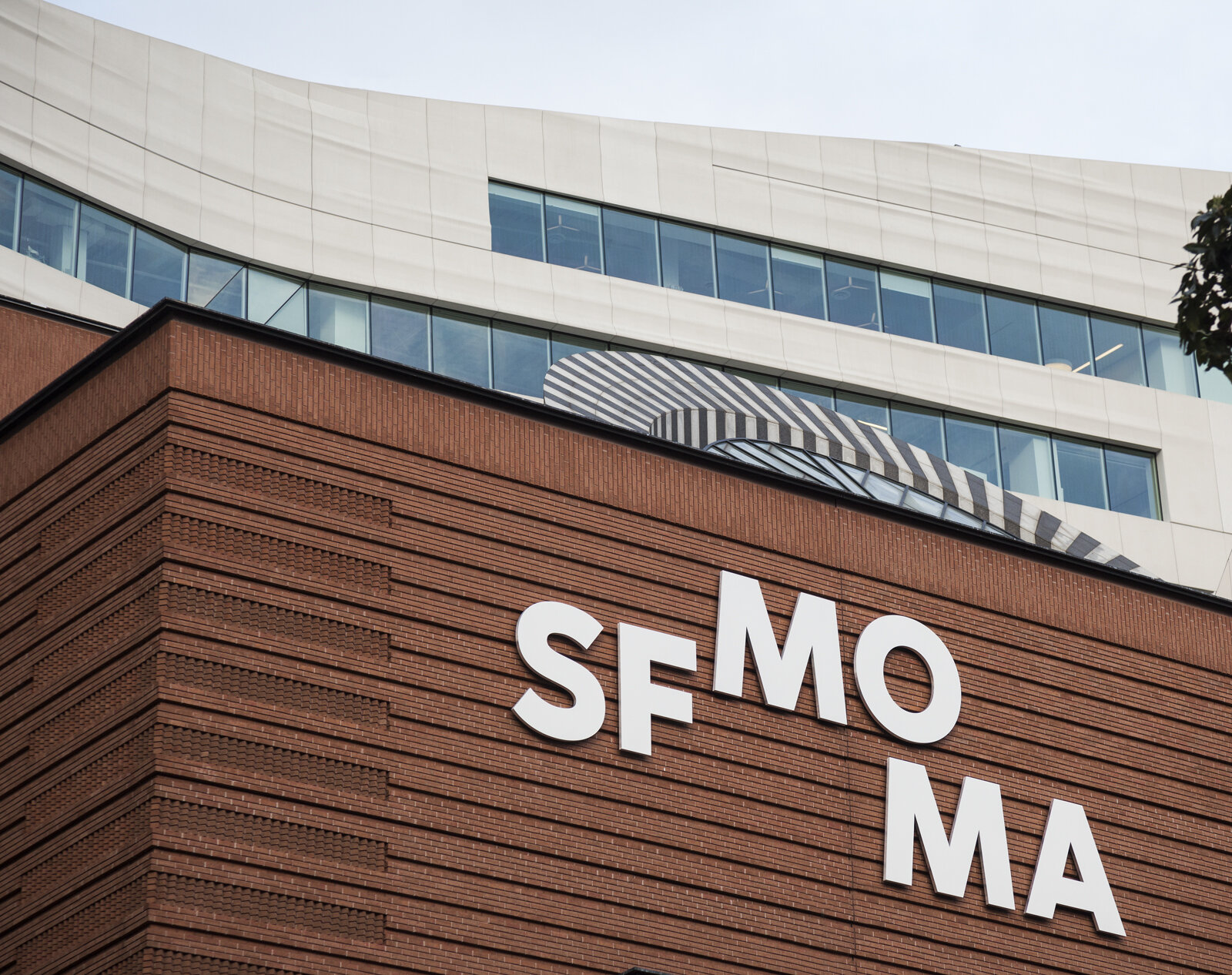
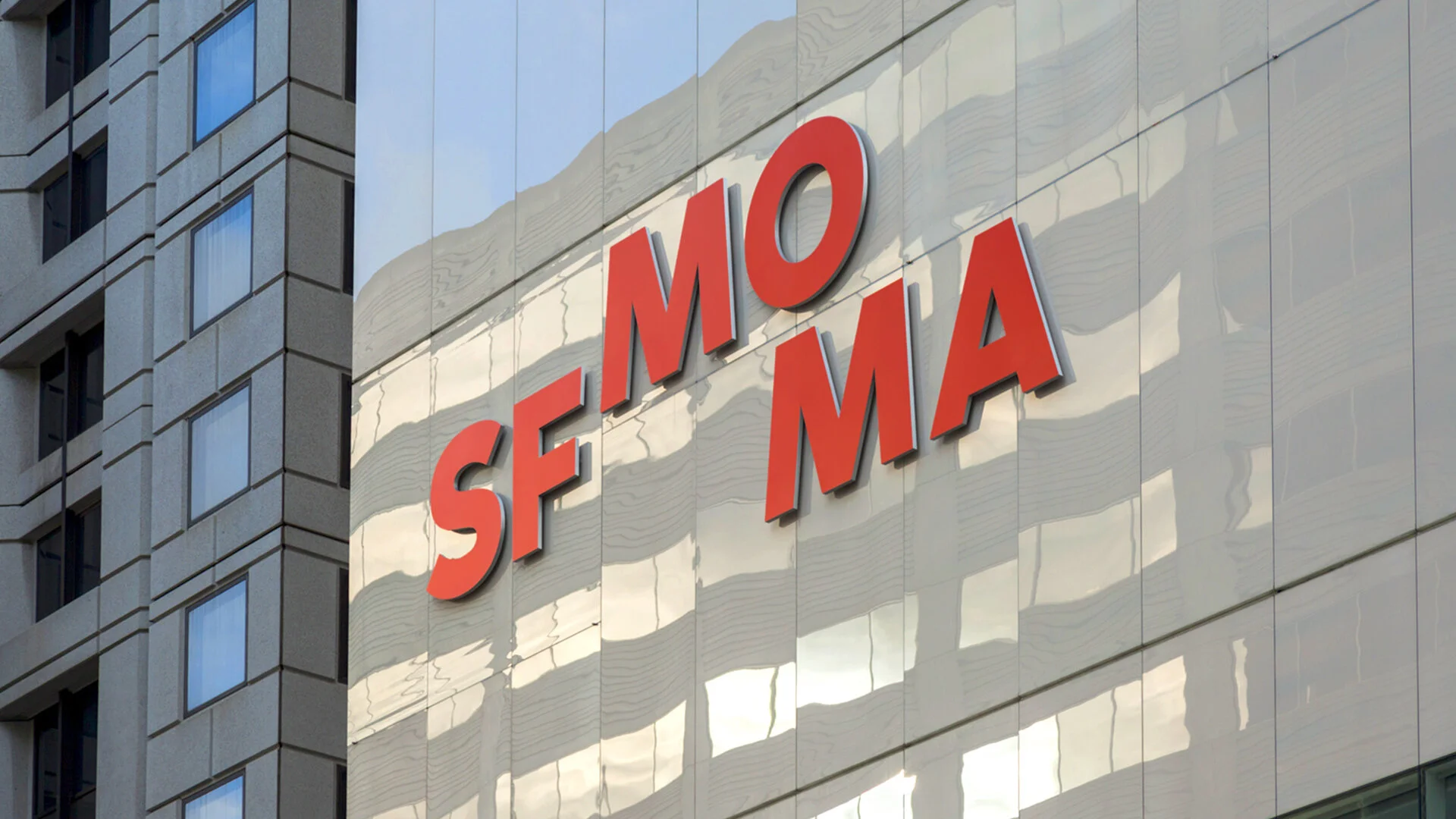
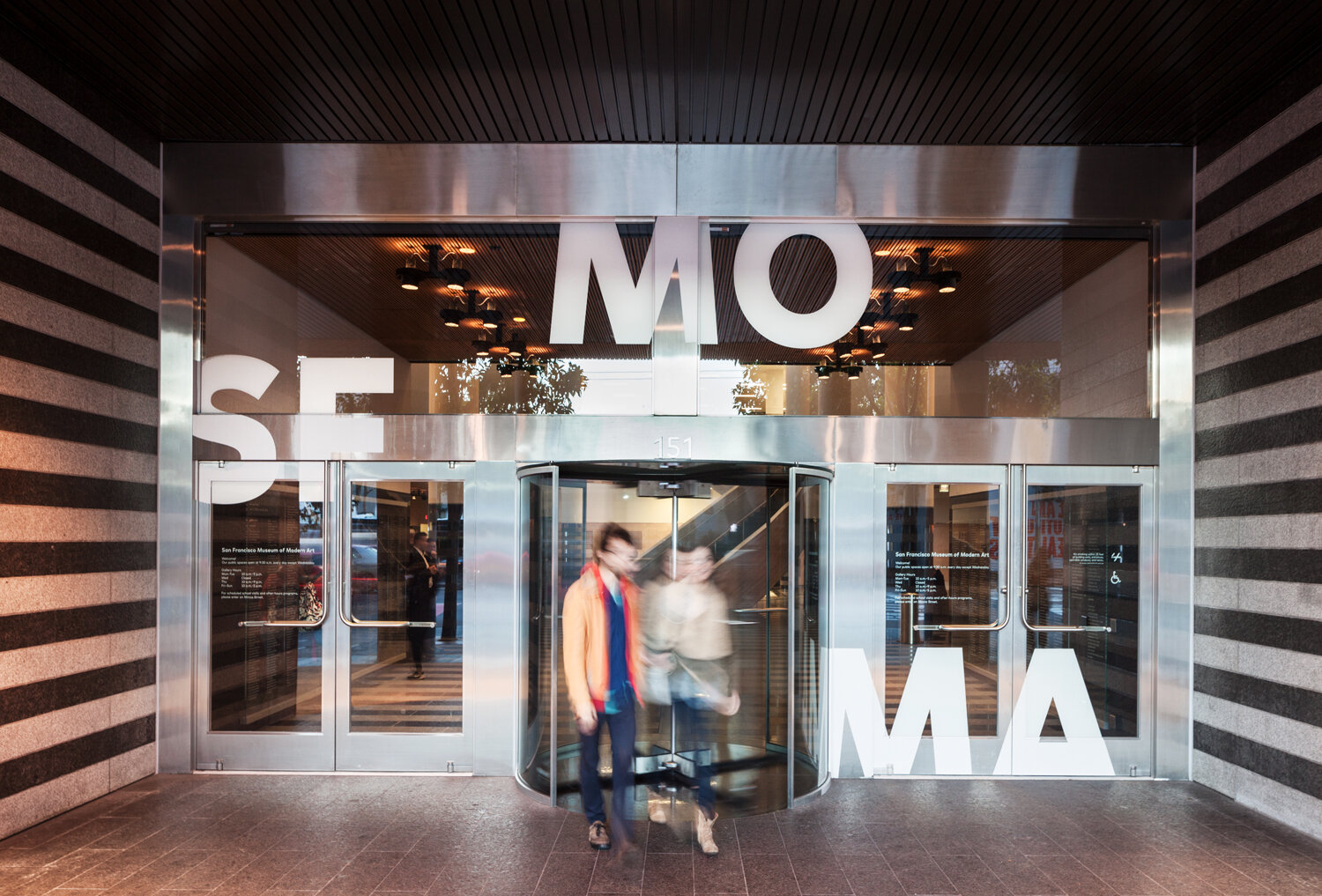
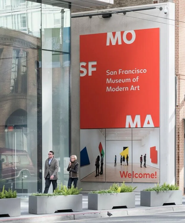
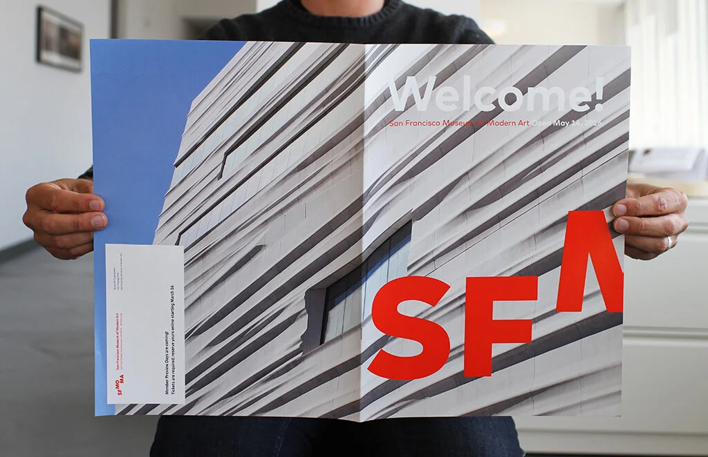
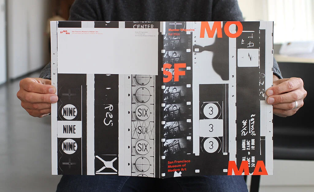
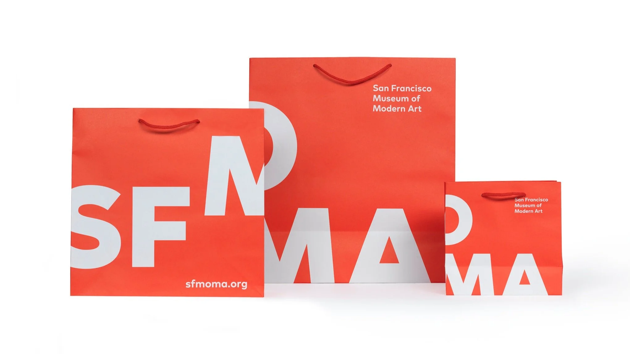
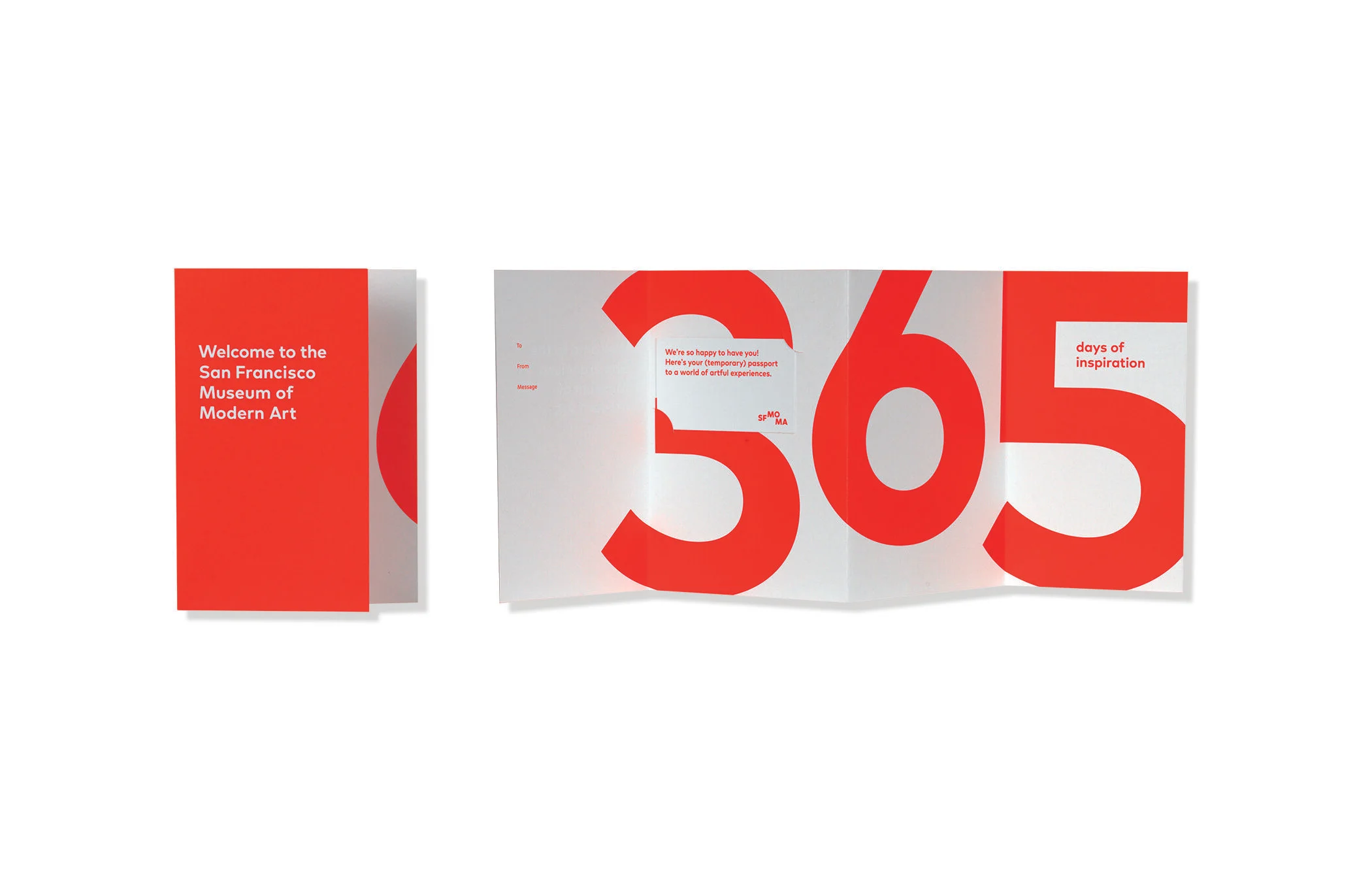
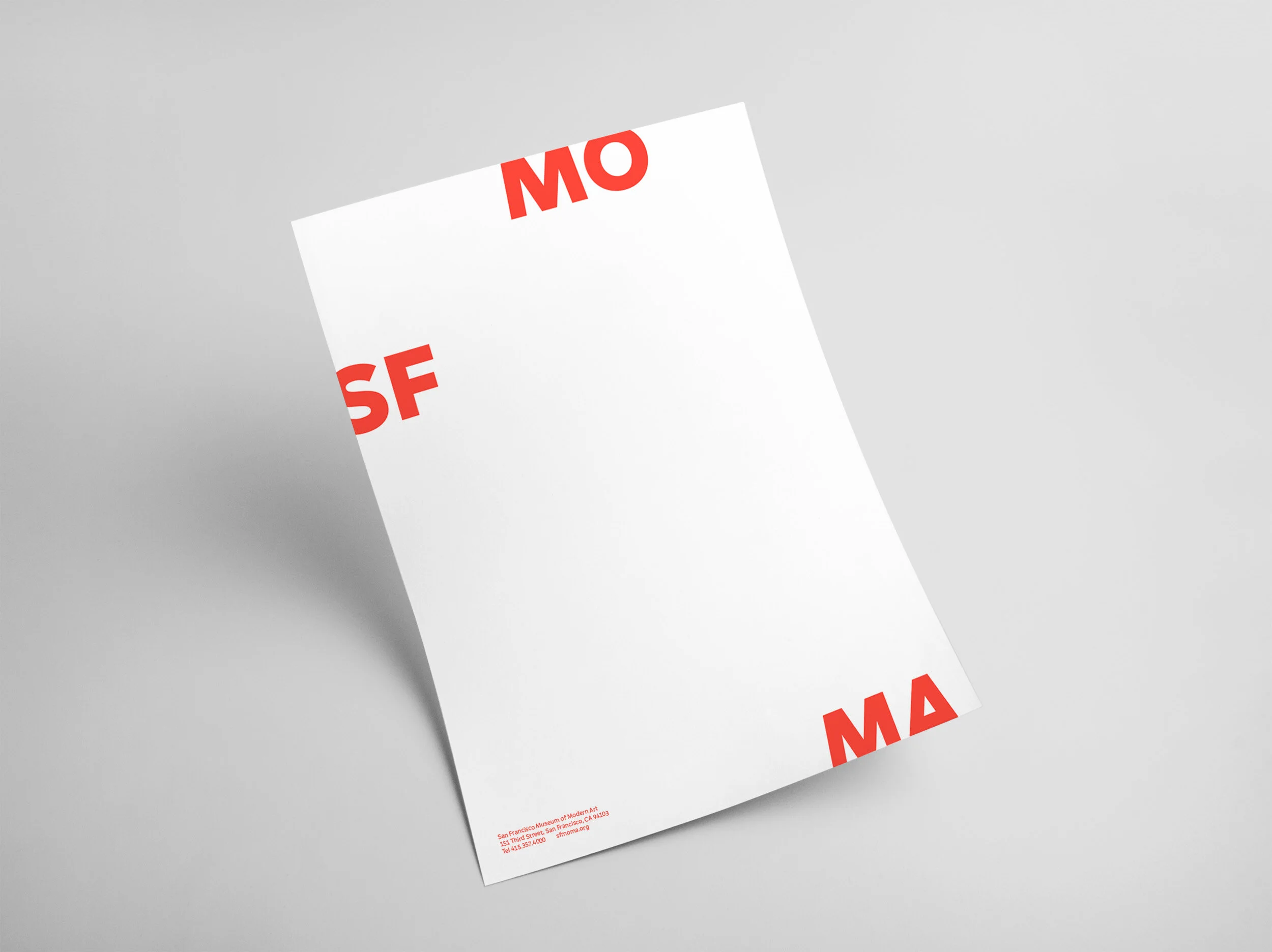
Expand and ContractThe logo oscillates between a ‘contracted’ and an ‘expanded’ version. The two states actively respond to different formats and content, allowing the identity to become a conceptual lens through which the program of the museum is experienced.
Brand System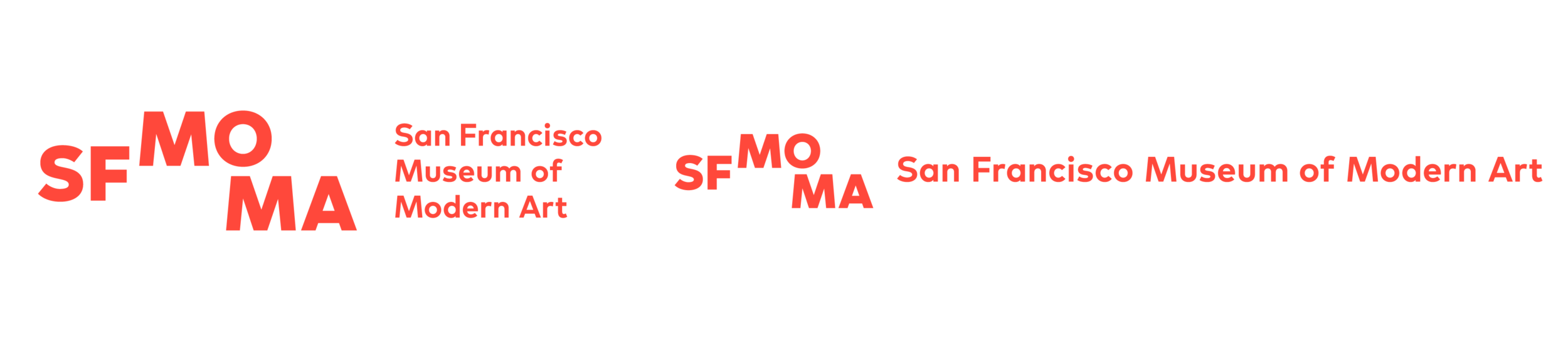
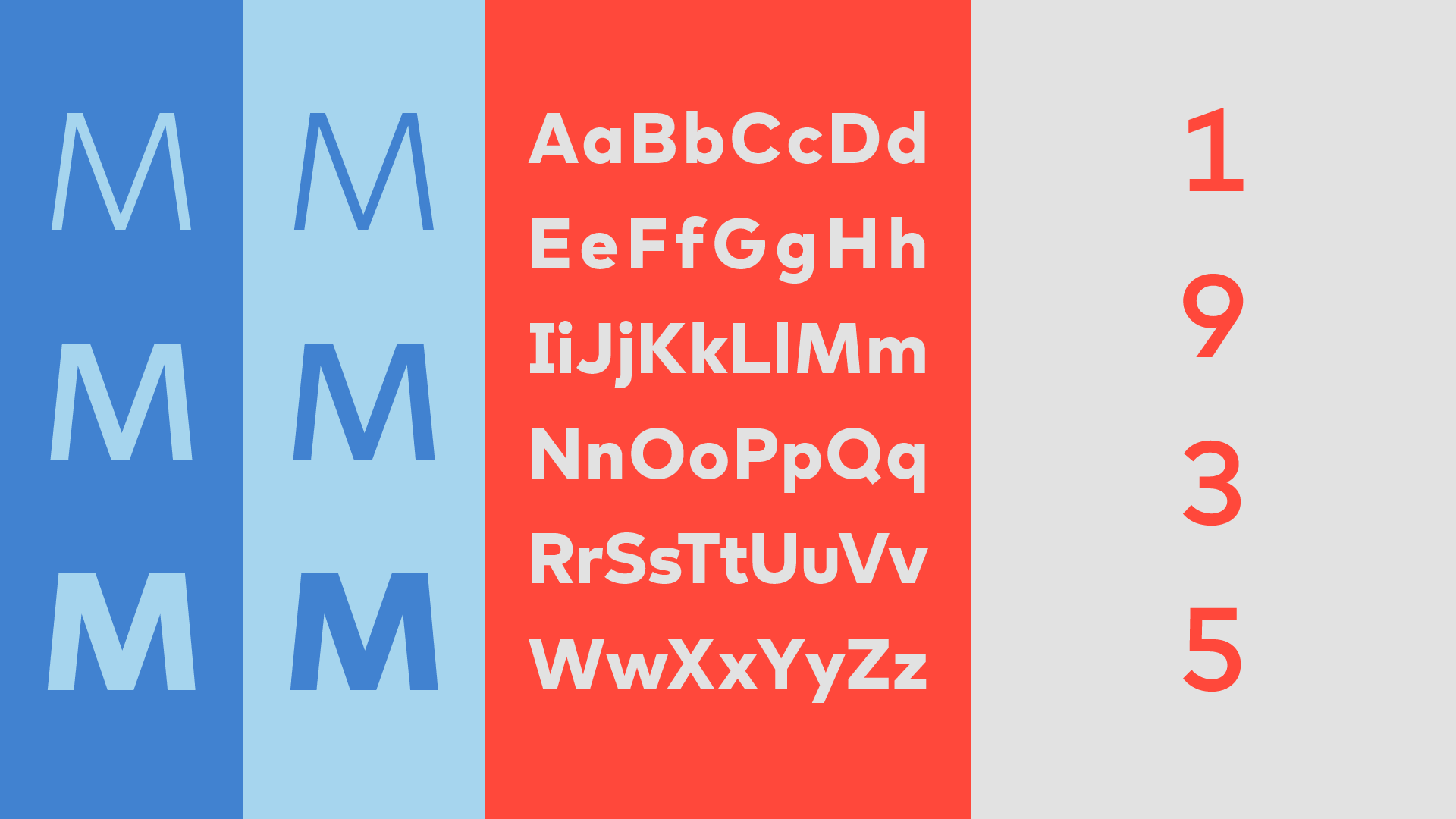
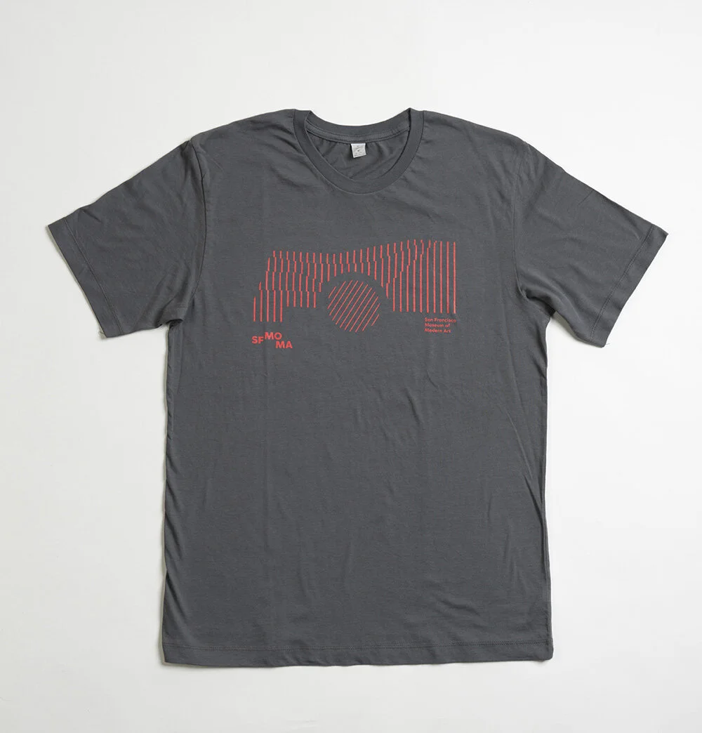
Typography An essential ingredient of the new visual identity is the custom typeface. It serves as the glue, providing distinction and cohesion throughout the entire program. A very flexible typeface was required to address the museum's specific needs,— a wide range of contexts and from architectural signage to long-form reading in books to legibility on digital screens.
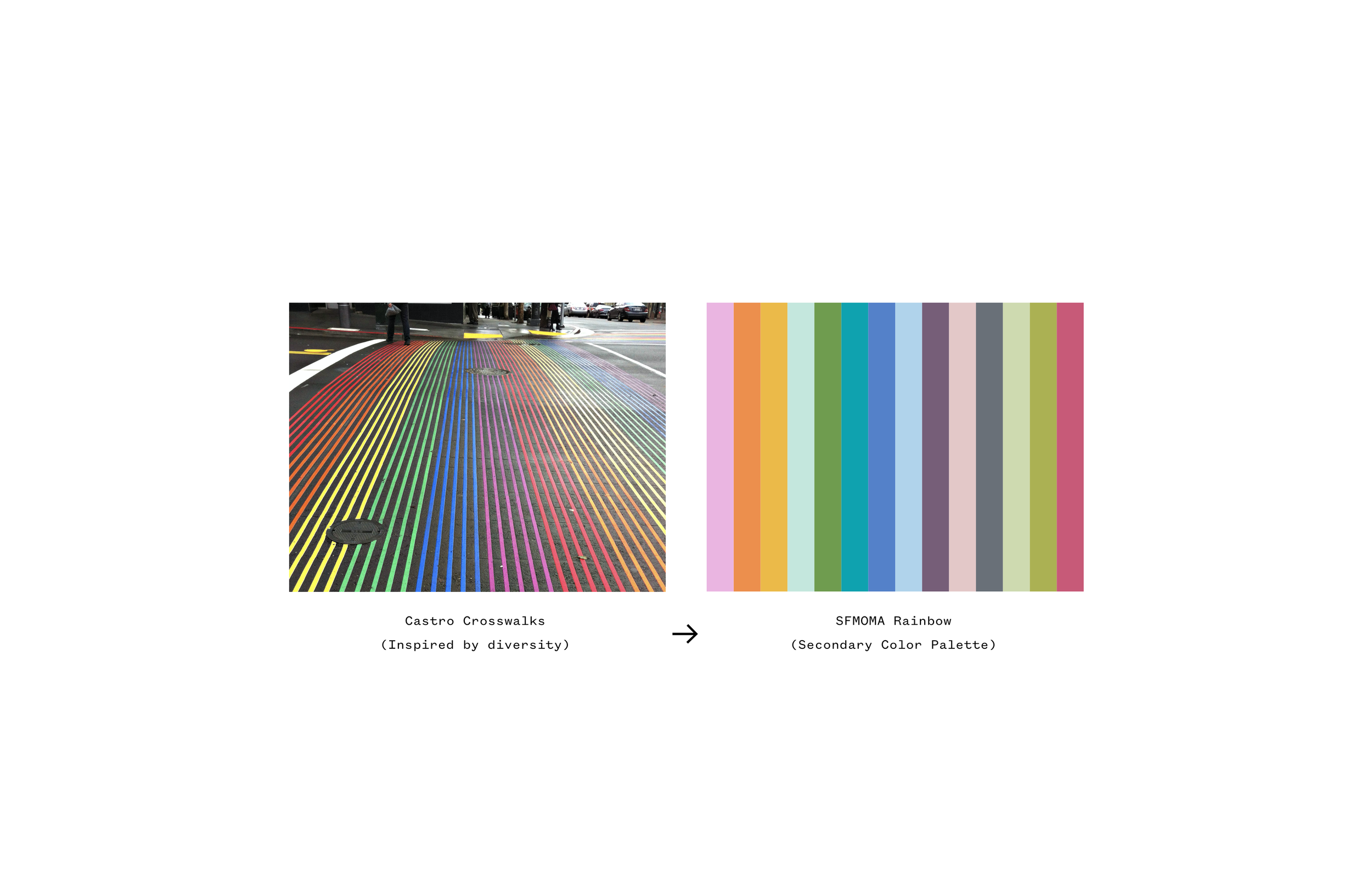
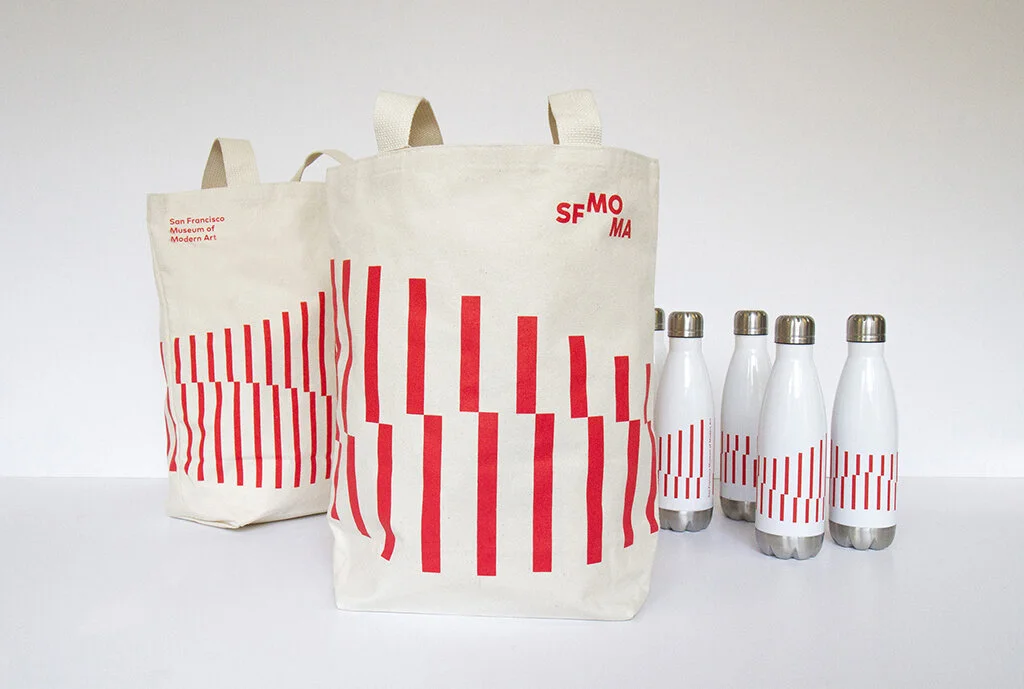
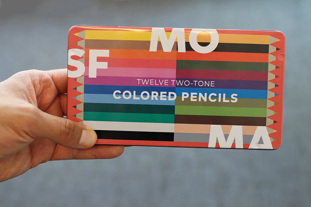
Color PaletteThe SFMOMA color palette is inspired by the city of San Francisco, its diverse culture, and unique geography. The primary palette is a reference to the three main colors on the museum’s building, and the extended palette is more of a direct reference to the city’s vibrant culture and diversity.

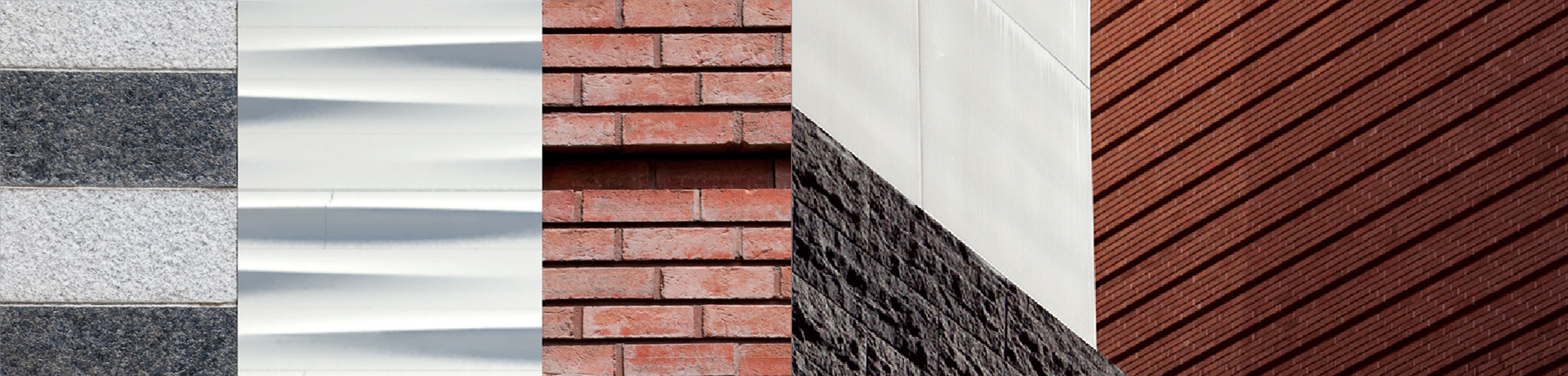

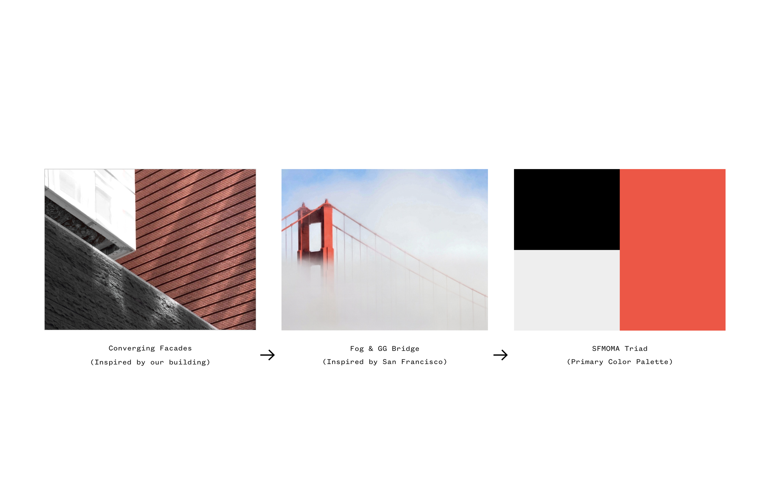
Graphic pattern A graphic pattern was developed in response to the various textures found on the interior and exterior of the building. Both structured and organic, the pattern references the hills of San Francisco as much as the museum itself.

My role: Senior Designer & Digital Design Lead
Agency: SFMOMA In–House Design Studio
Design Director: Jennifer Sonderby
Art Director: Bosco Hernández
Designers: Sophine Lim, Jen Schnell, Mathieu Stemmelen, Amy Yu Gray
Awards & Recognition: How in-house Best in Show, Print Magazine, Brand New, 20+ more…